_
The juxtaposition in this piece is light and dark but also includes a subtle nod to peace and chaos. Throughout the video, I wanted to show the big contrast between light and dark so while I filmed my shots, I made sure either have a very high or low exposure. I furthered the contrast by darkening the shadows and brightening the highlights after I uploaded the videos. I started the video in darkness with barely visible movement and I wanted to counter that with a very bright white flower that slowly took over the frame until it was taken away only to zoom out into another flower, but this time I wanted to do the opposite. I wanted the flower to be really dark and the background to be really light. To do this, I used the same shot of the flower but inverted the colors and for the background, I took a video of a forest with really high exposure. I wanted the video to seem abstract so for the next section and transition into the final scene, I shot a video of droplets of ink falling into water. I was able to create a smooth transition into a black screen where I reversed the video of the hand taking away the flower. From there, I incorporated the thought of peace and chaos with the flower beginning to move around the screen like crazy with the sounds getting louder and finally stopping and becoming silent. I wanted the very end of my video (The flower turning bright blue/green) to be up to the interpretation of the viewer. I thought about the idea of tranquility and peace helping view the world differently but it could mean something entirely different to another viewer.
Composition: Juxtaposition
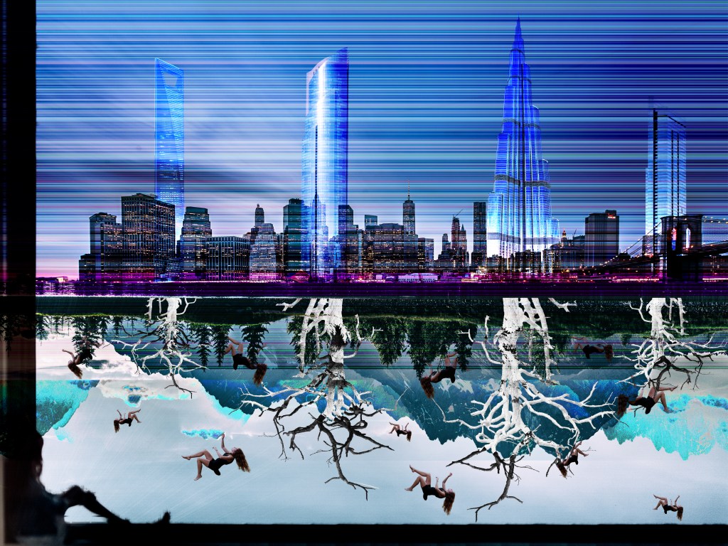
Composition: Glitch (2021)
_
For my glitch project, I chose the theme of man versus nature and more specifically how man takes from nature and how that is destroying them. To show that, I wanted to create half the piece with mountains and nature and the other half with a cityscape. I manipulated the mountain image on hex fiend and then audacity which only created a subtle glitch where you could still tell what the image was. I then put the cityscape image in audacity and the few changes I made really changed it. It turned into vertical lines of different colors. I decided to use both the glitched and non-glitched images. I originally had the mountains and buildings coming from the top and bottom of the page but after our first critique, I changed it so the mountains acted as the roots of the buildings. I then added really tall buildings with large but dead trees as their roots with different color blending options to further the glitch. The final pieces were the people falling into the roots and whatever lay beneath to represent our detachment from reality, and the woman sitting at the window sill looking upon the whole scene.
–
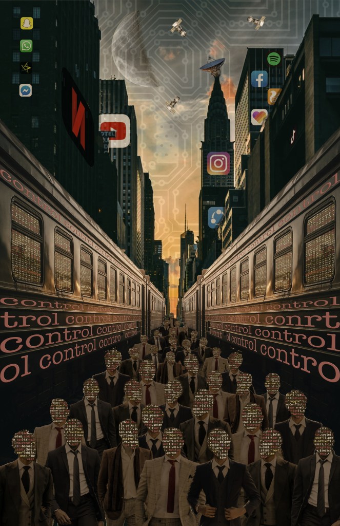
For my this project, I wanted to show a world controlled by technology. I started with a view down the street in downtown New York and filled the streets entirely with businessmen but replaced their faces with code. This for some reason made my computer lag so much that it almost made my computer crash so I ended up taking a screenshot of all the men with faces of code and using that instead. I then added trains on either side of them with the repeating word ‘control’. This, along with many commonly used applications on the buildings, was to amplify the idea that we will soon be controlled by technology. I added multiple things referencing space including the moon, satellites, and a satellite dish in an attempt to convey the idea that space exploration and exploitation are also imminent. This piece was meant to be created using the visual language of an art movement and I chose the dada art movement. I showed this through the illogical idea that our faces will be wiped away and our sky will become a circuit board. I also attempted to have a similar aesthetic and made the whole piece more sepia-toned.
Composition: Dada (2021)
–
Created in p5.js, this piece took data taken over the course of a week in relation to my climbing. Using different sizes, colors, and shapes to differentiate my data points allowed for each session to be unique and the key on the right side could assist the viewer in seeing the difficulty, magnitude, and success of each one of my sessions throughout the week.
–
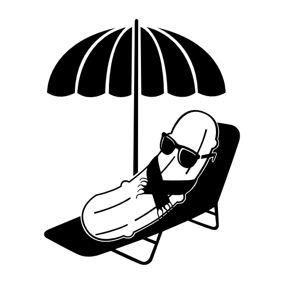
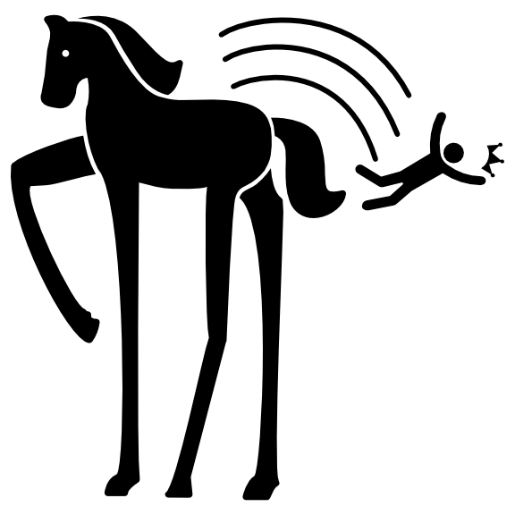
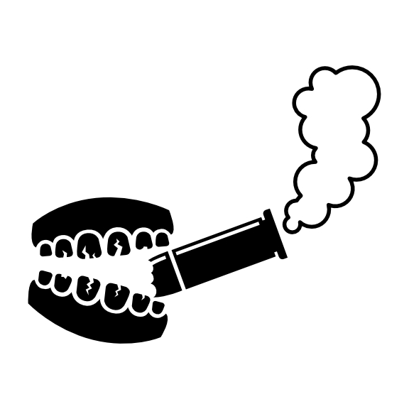
In this piece, I wanted to have slightly different aesthetics although looking back on them now they still are pretty similar. “Cool as a Cucumber” originally was just a cucumber with glasses but then the inclusion of the scarf added to the fact that he might have also been chilly and not just cool as in swagger. I then included the chair and the umbrella to create more of an environment for the character. For “Get Off Your High Horse” I chose to do simpler icons. One thing I continually did while working on this made the horse’s legs longer and longer to more easily show that this was literally a very tall (high) horse. I then added the crown falling off the head of the person which plays off the meaning of the phrase of being arrogant or haughty. I was not quite sure exactly what I wanted to do for “Bite the Bullet” until the professor suggested it be as if the mouth was smoking the bullet as if the character was actually biting the bullet and going back to smoking. I included the bullet with a piece missing implying that the bullet was actually bitten and the cracked teeth to convey that it is a bad thing to bite the bullet. Overall, these were really fun combining the literal meanings and the actual message behind the idioms into my project.
Composition: Idioms (2021)
Composition: Wireframe (2021)
–
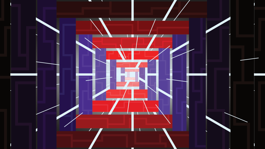
I started with my “Light at the End of the Tunnel” project and it was originally going to be my motion one of coming forward. As I worked on it though, the vision I had really fit well with that cliche which allowed me to really improve it. I originally just had the rectangular shapes and the solid beams of light weaving in and out of the rectangles. It looked pretty good but was still very simple. Adding the radial gradient to the center really helped convey the idea of light and even after that it still seemed like it could use more detail. I then added smaller lines representing the rays of light which really filled in the composition and I was having so much fun working on this I continued by adding those geometric designs into the rectangles to contrast the radial motion of the light rays.
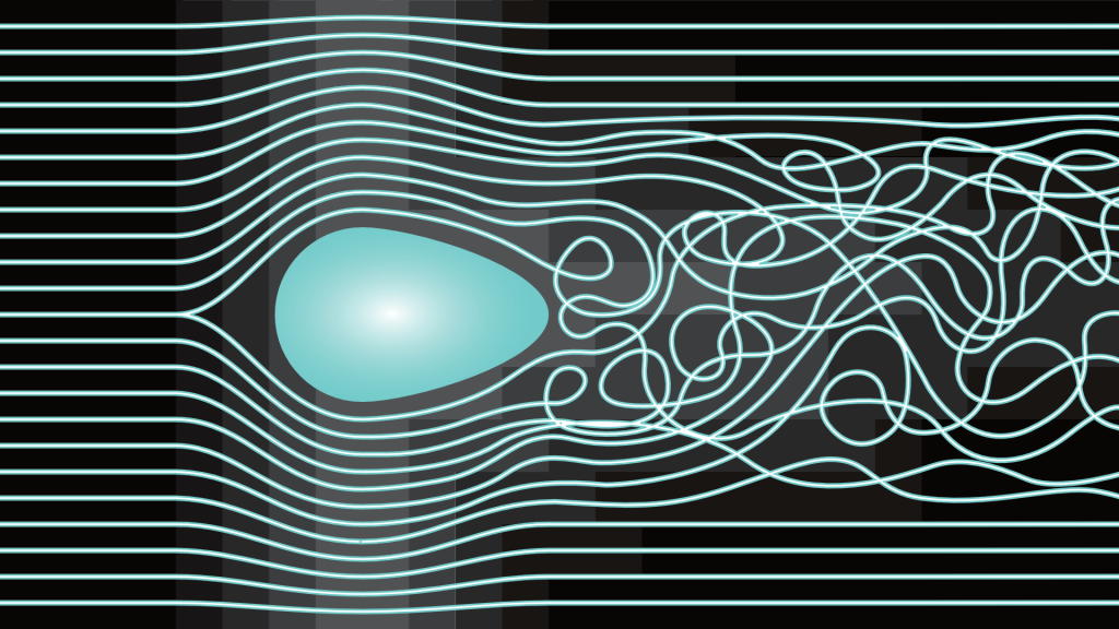
I got the idea for my motion project from my roommate who was working on something that had to do with turbulent flow. It was a really cool and unique idea that I thought would be really cool to try and represent. It took a lot of time to create all the perfect guides and grids but once that was all set it wasn’t very difficult to create my piece. The lines were supposed to represent airflow as they passed around an object that I originally had in the center of the page with one end reaching the ⅔ point. I was suggested to move it to the left at the ⅓ mark and that really helped my composition and show the craziness of the lines after they passed the shape. I also included subtle geometric gradient-esk shapes in the background to highlight the areas where the lines were warped the most. Overall, my projects grew and changed over time to become much better than originally thought possible.
Composition: Typography Portrait (2021)

