March 2025 | Joe Goodacre
View The Acre website here.
What is The Acre?

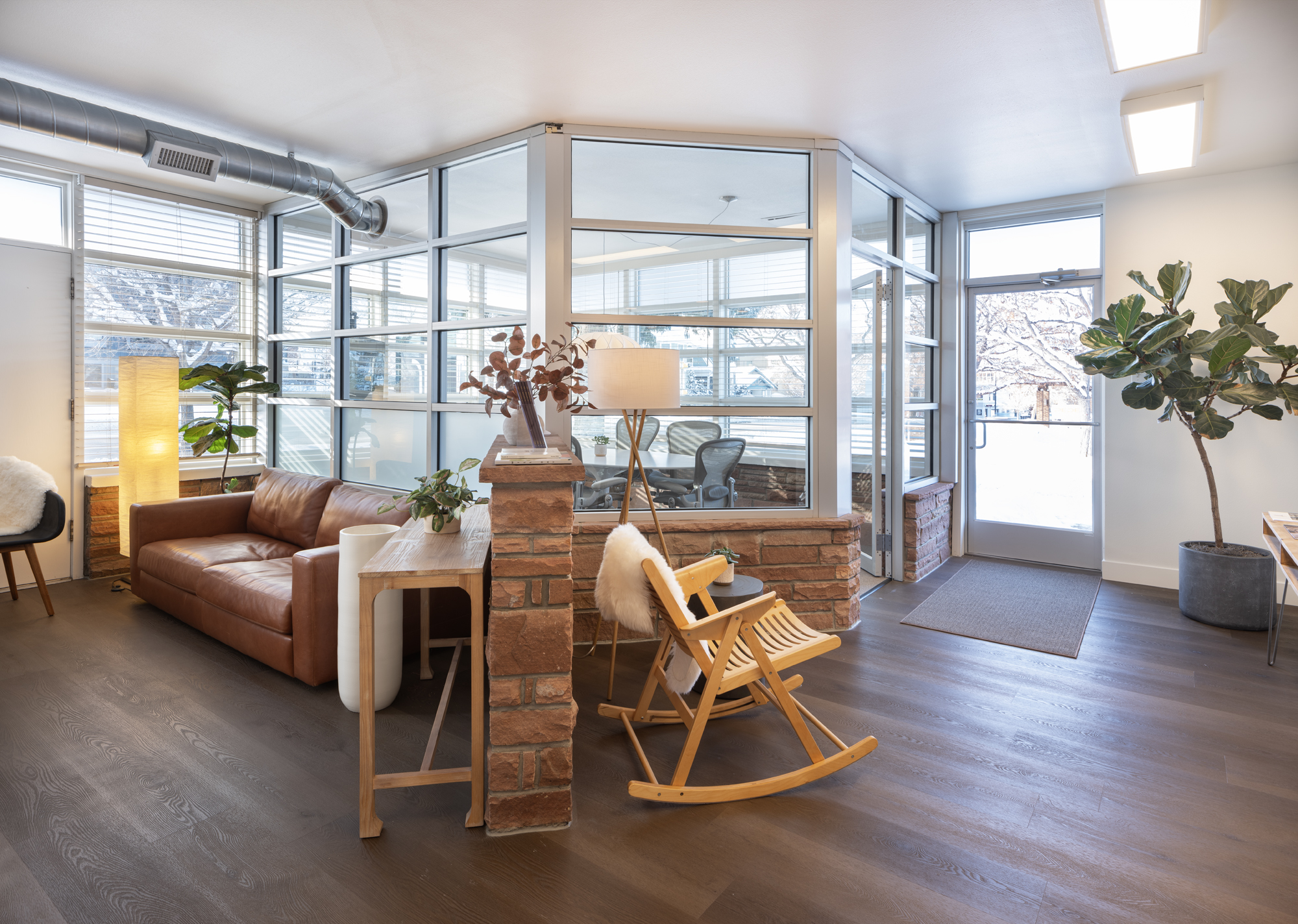
The Acre is a brand-new coworking space nestled in the heart of Boulder, Colorado where business owners and workers alike will be able to thrive in a workspace designed to foster creativity and productivity. Founded by Goodacre and Company, a family-owned business with over 50 years of experience in Boulder County real estate, The Acre will offer a unique blend of history and modern amenities.
Problem Statement
Workers who are tired of working from home or want a private office space need a platform that gives them access to a coworking space that suits their needs in order for them to become more productive.
Understanding the User
The target audience for this product is workers and small business owners looking for a private office available to rent where they can effectively get work done. The user will want amenities at their disposal that are clearly defined and convenient. Their goal is to understand if the space is right for them as quickly and easily as possible.
Building the Brand Identity
As a brand-new business, The Acre needed to define its identity through branding and marketing. This entailed creating a style library to choose colors, typography, logos, and visual style.
Color and Typography
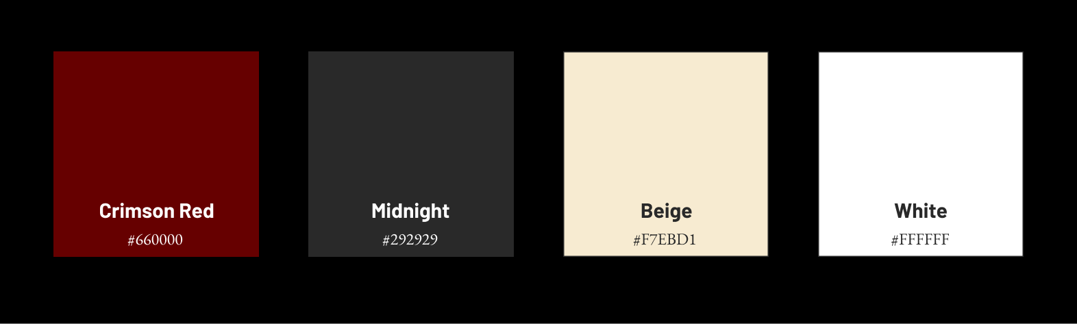
In developing The Acre’s color scheme, it was essential to maintain a strong connection to Goodacre and Company while introducing elements of uniqueness. The primary crimson red aligns with Goodacre’s branding, ensuring continuity, while the supporting colors were intentionally chosen for their subtlety, complementing the boldness of the red without competing with it.

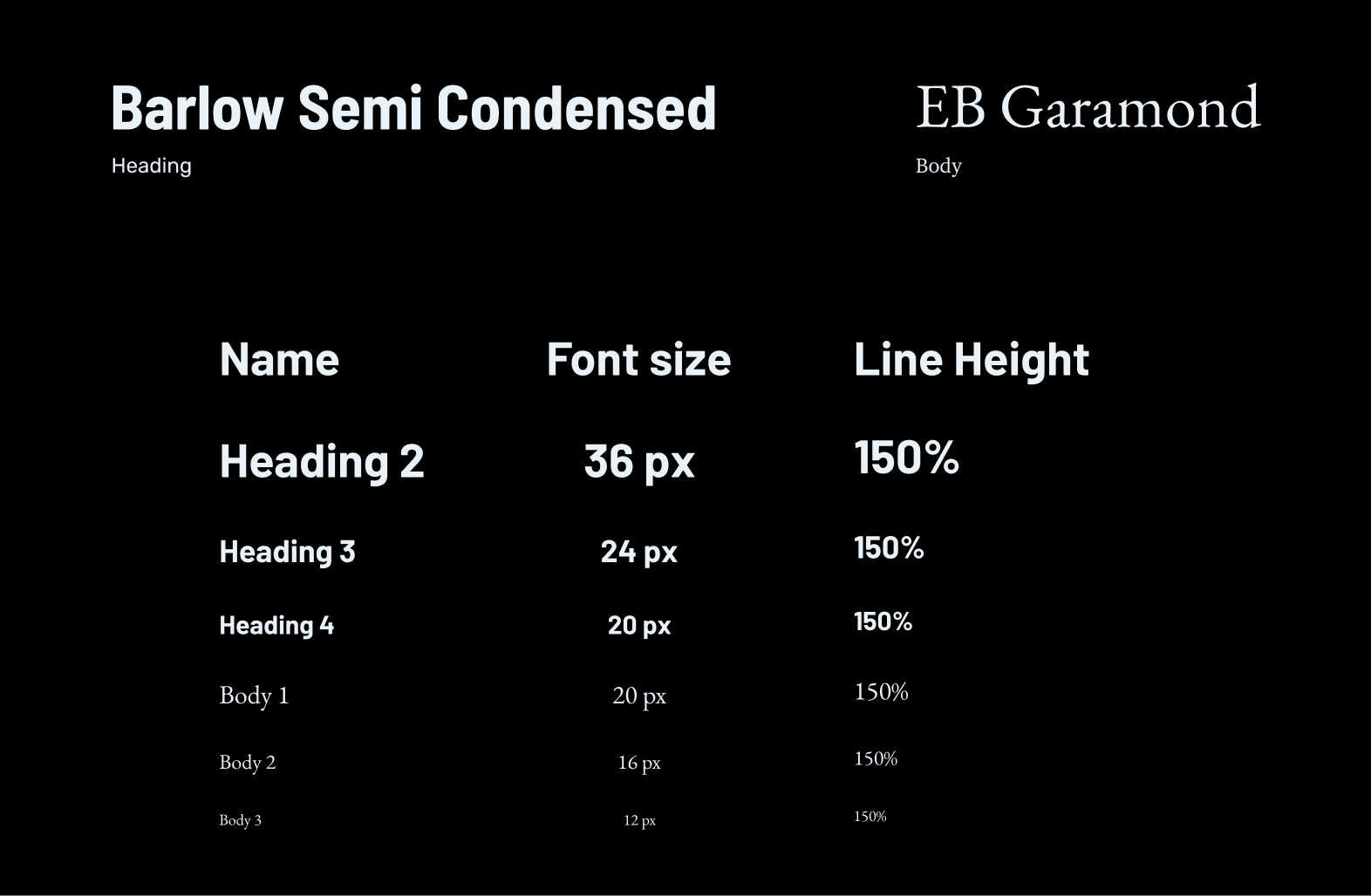
The typography for this design combines Barlow Semi Condensed for headings and EB Garamond for body text, striking a balance between modern readability and classic elegance. Barlow Semi Condensed, a clean and slightly condensed sans-serif, ensures bold, impactful headings, while EB Garamond, a timeless serif, enhances readability for longer-form text. The hierarchy is clearly defined with varying font sizes and a consistent 150% line height, reinforcing clarity and accessibility. Prioritizing simplicity in typography enhances user experience, ensuring information is easy to scan and digest as prioritized in the user goals.
Logos and Visual Style
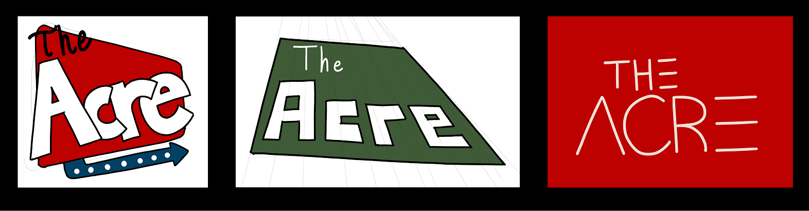
The Acre logo went through many iterations, with many different styles taken into consideration, ranging from retro to minimalist. The final iteration implements aspects of the building itself while maintaining simplicity and sharp angles to draw the eye.
Stage 1
Stage 2
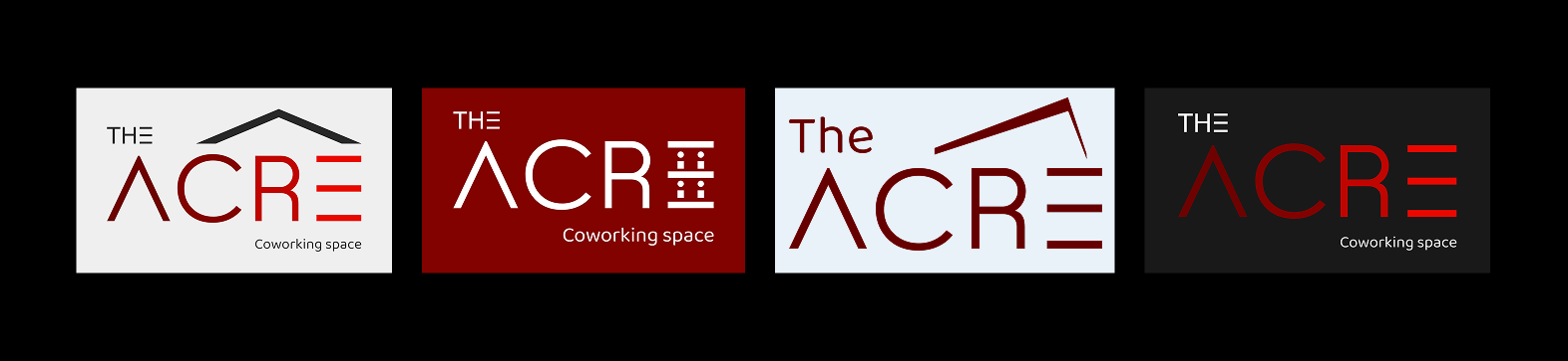
The icon design is derived from the architectural features of the building, ensuring a strong visual connection to the brand’s identity. By abstracting key structural elements, the icon maintains a personalized and recognizable aesthetic that reinforces brand authenticity.
Website Design
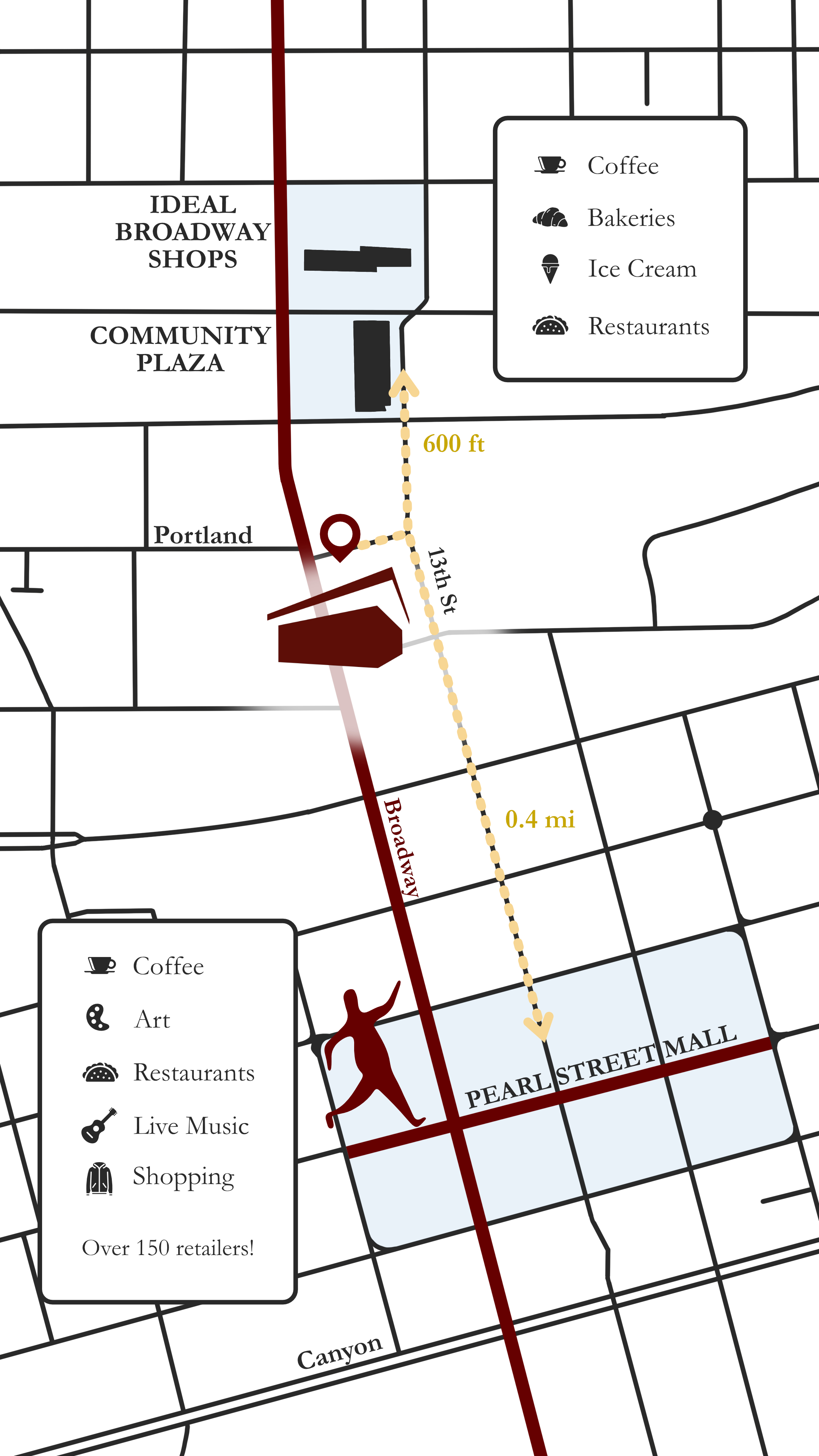
Through research and competitive analysis, The Acre website was designed by our team to highlight the simplicity of exploring our spaces and amenities while getting a true sense of The Acre’s warm and inviting environment. While other coworking spaces may be larger, The Acre offers optimal location within the Boulder area. The importance of this was placed on my shoulders to implement into the website. A simple cartoon was created with a video soon to come.
Next Steps
With The Acre’s website live, the focus shifts to evaluating performance data, user behavior, and industry trends to optimize its effectiveness. As The Acre expands, the website will scale alongside it, incorporating new features, additional content, and an evolving digital presence to support long-term growth.
View The Acre website here.
